Sidebar
Files Page
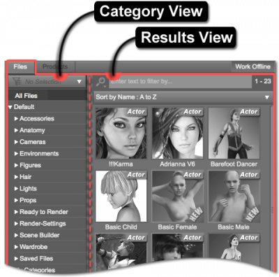
 The purpose of the Files page is to display and provide the ability to interact with each Asset individually. The ability to interact with multiple assets at once is provided by way of extended_selection, marquee_selection, drag and drop, and/or the context menu.
Conversely, interacting with collections of assets in a broader sense, as Products, is accomplished via the Products Page.
In the Files page, selecting the “Arms” sub-category under the “Accessories” category might display four or more individual assets classified as arm accessories. In contrast, selecting the “Arms” sub-category under the “Accessories” category in the Products Page might only display two unique products that contain arm accessories.
By default, the Files page displays each asset as its own icon, in contrast to the Products Page, which displays all of the assets provided by a single product as a single icon. Asset icons are square in shape, while product icons are rectangular. Hovering the cursor over an asset icon will cause a tool_tip to be displayed, and that tool tip may include a larger colored version of the asset icon—the product packaging will determine whether or not a larger icon will be displayed.
Selecting a category causes the assets assigned to that category to be displayed in the Results View. Additional options exist that allow for different kinds of filtering to be applied and for finer control over which assets to display. For instance, with the “Wardrobe” category selected, the Results View might display assets for pants, shirts, boots, etc. With the Filter By Context option checked, the list of assets might be further refined to include only those that correspond with the selected figure in the scene.
Views
The two primary views displayed within the Products page are:
-
- Compatibility Selector
- “All Files” Filter
- Categories
- Filter By Context
-
- Filter Bar
- Sorting Selector
- Asset View
Other embedded asset views displayed within the Products page are:
-
- Category View (General)
- Asset View
-
- Category View (General)
- Asset View
-
- Category View (General)
- Asset View
