Sidebar
Add-On Assets View
The Add-On Assets View functions much like the Files Page, except that it displays assets that customize and correspond with a context_asset for the view (i.e., “Add-Ons”), rather than the selected object in the scene. Right-clicking an asset in an Asset View (General) and selecting the “Explore Add-Ons…” option in the context menu will cause the encompassing page (i.e., the Files Page or the Products Page) to display the Add-On Assets View, so that the assets that work directly with that asset (or can customize that asset) are displayed. For example, a dress asset may display materials and corresponding robes as add-ons for the dress.
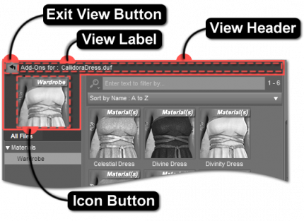
View Header
The View Header encapsulates the graphical elements that are indicative of an embedded view. When these elements are displayed, the user can be confident in knowing that the behavior of the view is in the context of a product or an asset, rather than the selected state of an object in the scene.
Exit View Button
Clicking the Exit View Button exits the Add-On Assets View and returns to the primary view of the hosting page—i.e., the Products Page or the Files Page.
View Label
The View Label displays the view type, followed by the name of the context asset (the asset that the other assets displayed in the view help customize).
Icon Button
The Icon Button displays the icon of the context asset for the view. Clicking the button (single-click) causes the asset to load into (or be applied to) the current scene, as it would if it were displayed in the Files Page.
Views
The two primary views displayed within the Add-On Assets View are:
-
- “All Files” Filter
- Categories
-
- Filter Bar
- Sorting Selector
- Results
Other embedded asset views displayed within the parent page are:
-
- Category View (General)
- Asset View
-
- Category View (General)
- Asset View

