Sidebar
User Interface (UI)
Description
The 3D world is a complex place. There is a lot to know and even more to learn. It is constantly evolving with more creation and customization possibilities, all of which have to be exposed and explained through an interface. And preferably one that not only possesses powerful features but makes it easy and fun.
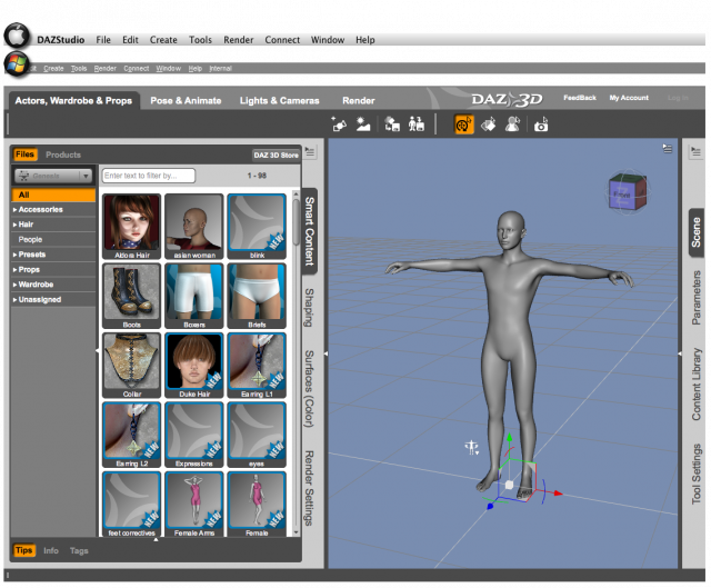
The Daz Studio 4.x interface provides various layouts and styles that aim to find a balance between fun, easy, and powerful. Serving such a diverse range of passionate and creative users requires flexibility in the interface design. That flexibility is what allows various elements to be resized, repositioned, and rearranged to better suit your workflow.
However, that flexibility also comes at a price, creating some complexities that are above and beyond the 3D aspect of the application.
This section of the Reference Guide peels back the layers of the interface to provide the information needed to make the most out of the default layouts or customize the layout to better suit your workflow.
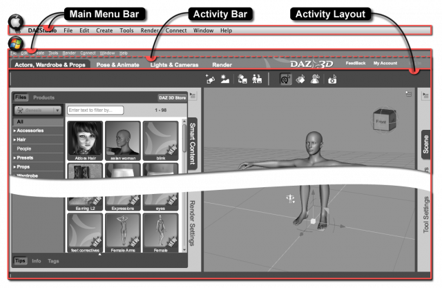
Each page provides an image with an annotation indicating the current level of interface. That level is then described below the image. Below that, each parent and child element is briefly described, with a link to more information about each element. An image, with annotations calling out the various elements listed, is provided as shown below. This pattern is repeated throughout the UI section of the Reference Guide.
Child Elements
Below is a list of interface elements that exist within the Main Window of the application. These elements are populated and arranged according to a Layout:
- Main Menu Bar - a container that provides quick access to various Actions in Menu form that perform a wide range of tasks on the 3D scene, the items in it, the interface, and/or to the application itself
- Activity Bar - a container for interface elements that allow you to quickly switch between Activity-based layouts and provides convenient links to common Daz 3D online services
- Activity Layout - a container for the interface elements that can change position, size, state, visibility, etc., for a given Activity
Element Index
This list is provided as an alternative to the structured approach above and is intended to be used for quick access to the various elements. The content of each page in the list is the same, regardless of which navigation method you use.


