Sidebar
Results View
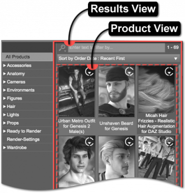 The Results View displays the items filtered by the selected category in the Category View and optionally the text entered into the Filter Field.
The Results View in the Install pane is very similar to the Results View in the Content Library and Smart Content panes in the way that the individual assets are displayed and decorated.
Product View
The Product View displays individual products that contain individual assets assigned to the selected category. For instance, a product that contains an Arm Band asset might be displayed when the Accessories > Arms category is selected in Category View—not because the product is assigned to the category but because the arm band asset is. Products are not assigned to categories; assets are assigned to categories.
Hovering the cursor over a product icon causes a Tool Tip with a larger color version of the icon to display. Double-clicking a product icon will install it. Right-clicking the product icon and choosing the appropriate option from the Context Menu will also install that product.
For more specific detail related to how the products are displayed and what the various decorations mean, see the Results section.
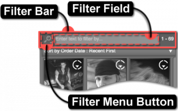
Filter Bar
This area of the view provides options for filtering items based on a specific keyword, or set of keywords; clearing any keywords that may have been entered; accessing and managing saved filters; and displaying information about the number of matching results as well as a busy status.
Filter Menu Button
The Filter Menu Button provides consistent and convenient access to a menu populated with actions that pertain specifically to the text entered into the Filter Field. Clicking the button causes the Filter Menu to display.
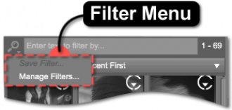
Filter Menu
The Filter Menu provides access to installed and/or user-created filters, along with the actions that provide access to saving and/or managing custom filters.
Clicking a Filter in the Filter Menu replaces the contents of the Filter Field with the text of that filter.
Clicking the Save Filter… action, near the bottom of the Filter Menu, causes a “Save Filter” dialog to be displayed.
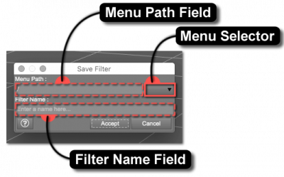
Save Filter
The Save Filter dialog provides options for defining the Menu Path, as well as the Filter Name. The selector at the end of the Menu Path field is populated by any existing menu paths. Selecting a path from the list will replace the contents of the Menu Path field with the chosen value. The Filter Name field provides the ability to name the filter—the value of which must not contain characters that are not permitted, by the operating system, within file names. Once a valid Filter Name has been entered, the Accept button becomes enabled. Clicking the Accept button causes the dialog to disappear and the word or phrase entered into the Filter Field to be saved as an option in the Filter Menu for future use.
Manage Filters
The Manage Filters… action is used to launch an OS file browser window and opens to the folder that user-created filters are stored in. Which folder is opened depends on the type of items represented by the associated view.
The structure of the folders and files that reside within this folder directly correspond to the menus and filters displayed in the Filter Menu. Each page and/or pane uses a different set of filters, depending on the type of item represented by the associated view. These filter sets are stored in folders that exist parallel to the opened folder. As changes are made to the structure and/or contents of these folders, the same changes are automatically reflected in the Filter Menu the next time it is shown.
Filter Field
Entering a keyword into the Filter Field reduces the list of items to display. For instance, inserting the word “sword” into the field causes a search for items with the keyword “sword” associated with them and then displays only those items in the Results View.
Insert brief description and link to Advanced Filtering (e.g., Advanced Filtering).
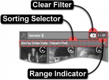
Clear Filter
The Clear Filter button clears any keywords entered into the Filter Field. Note that this option only appears when text has been entered into the Filter Field.
Range Indicator
The Range Indicator displays how many items meet a specific criteria. For instance, if the selected category has nine results in it, the indicator would display 1–9. Similarly, if a keyword were then entered into the Filter Field, and only four of the results had that keyword associated with them, 1–4 would be displayed instead.
When a different category is selected in the Category View, the range changes to display how many items are associated with that specific category—the same applies to changing which keyword is entered into the Filter Field. If no results meet the current criteria, or no criteria has been defined—i.e., no category is selected—the indicator will display 0–0.
Progress Indicator
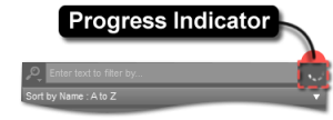
The Progress Indicator shows the status of a query into the content database. This indicator only becomes visible when the application must filter through a large enough set of records in the database to find results. The indicator is animated to signify that the application is busy or “in progress” and not stalled.
Sorting Selector
Use the Sorting Selector to change the order that items are displayed in the Results View. Click the selector to display a list of sorting options, then choose an item in the list to reorder the displayed results.
The sort order options include:
- Sort By Name: A to Z
- Sort By Name: Z to A
- Sort By Product ID: Highest First
- Sort By Product ID: Lowest First
- Sort By Release Date: Recent First
- Sort By Release Date: Oldest First
- Sort By Order Date: Recent First
- Sort By Order Date: Oldest First
- Sort By Install Date: Recent First
- Sort By Install Date: Oldest First
- Sort By Last Update: Recent First
- Sort By Last Update: Oldest First
- Sort By Group ID: Lowest First
- Sort By Group ID: Highest First
Install State Filter Bar
The Install State Filter Bar provides access to several filters based on the installed state of a product. These filters operate in conjunction with the selected category and any options in the Category View, any keyword(s) entered into the Filter Field, and the sort order selected in the Sorting Selector:
- Available - filters the Results View to display products that are not currently installed but could be installed using daz_connect
- Pending - displays the products that are waiting to install using Daz Connect
Install/Cancel Selected Button
The Install/Cancel Selected button is enabled/disabled based on the selection of the active filter. The text of this button displays “Install Selected” when the Available filter is selected. Select products using a combination of the Ctrl/Cmd and Shift keys to select more than one product), and then click the this button to install the products. When the Pending filter is selected, the text of this button displays “Cancel Selected.” Select products, also using Ctrl/Cmd and Shift keys, and then click this button to cancel the installation of these products.
Results
The Results View on the right displays the results of what is selected and filtered for in the Category View on the left. For example, if the “Accessories” category is selected in the Category View, the results displayed are products that contain assets that are accessories.
Icon
Each item displays an image, referred to as its Icon, to aide in visually distinguishing one item from another. These icons are typically in PNG (Portable Network Graphics) format.
Indicators
Each product has the ability to display additional decorations on its icon to signify what kind of asset it is, offer a hint about its loading behavior, how it might be used, and/or membership in a group. Indicators are typically represented in the form of labels and/or glyphs that overlay the corners of the icon.
Notice
If an icon for a product is missing, a triangle with an exclamation point (“!”) surrounded by a frame appears and signals that the image for that product's icon could not be found on disk. This notice appears in the center of where the icon would normally be.
Daz Connect
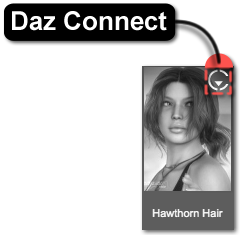
If a product was installed using Install Manager or some other manual method, an indicator that represents the ability to install that product using daz_connect may be displayed. Installing a product using Daz Connect enables the ability to then update that product, which is represented by an indicator and/or a colored border in the Smart Content pane when an update becomes available. Products that have been installed using Daz Connect, and do not have an update available, do not display the Daz Connect indicator.
Group
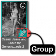
Assigning a Group to an item marks that item using colors and/or shapes and serves to establish user-definable collections or associations—much like using a highlighter on a page in a book or attaching stickers to objects in a room to draw attention to some form of relationship between the marked passages/items. By default, the application provides two distinct groups: None and New.
The list of available groups is designed to be extensible by end users but has a few rules that must be followed:
- Each custom group must consist of a pair of identically named PNG files that must exist on disk—one for assets, and one for products.
- Each pair of PNG files must follow the naming pattern id.label.png, where id is a unique positive numeric identifier for the group and label is the text that appears within the “Group As” sub-menu of the context menu for an item.
- Negative numeric identifiers are reserved for the application. (e.g., “New” = -1)
- These identically named PNG files must be placed in specific parallel folders of the application installation—i.e., ./resources/images/groups/assets and ./resources/images/groups/products.
Regardless of their respective sizes, the PNG images will overlay and be anchored to the bottom right corner of the icon of the item to which they are assigned.
Note: Groups are currently only added to the menu when the application launches. This may change in a future version.
Label
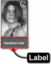
The Label is the word or phrase displayed directly beneath the icon, like Hawthorn Hair or Genesis 2 Female Base. The label is typically the name of the product or a subset thereof.
Context Menu
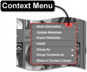
Right-clicking on a product displays a context menu of options relating to that product (or the set of selected products). These options include:
- More Information…, by default, launches the Help pane with the Read Me page for that product (for products that are provided by Daz 3D).
- Holding down the Ctrl/Cmd keyboard modifier while clicking provides additional Control-Freak-type options in an intermediate dialog.
- This particular functionality is provided by a “store script” that is responsible for determining what actually happens, specifically with Daz 3D Products. The “store script” system/API supports multiple stores.
- Update Metadata offers the ability to update the metadata on the selected product.
- Export Metadata… exports the metadata of the selected product through extended selection.
- Install offers the action to install the contents of the selected product.
- Group Product As > displays a sub-menu with options for selecting which group to assign the product to.
- New assigns the asset to the New group.
- None removes the product from any group that it is currently assigned to.
- <User-Created> assigns the product to the <User-Created> group. See Group for more information on how to create additional groups.
- Group Product & Assets As > displays a sub-menu with options for selecting which group to assign the product and its asset(s) to.
- New assigns the product, and the asset(s) it contains, to the New group.
- None removes the product, and the asset(s) it contains, from any group that it is currently assigned to.
- <User-Created> assigns the product, and the asset(s) it contains, to the <User-Created> group. See Group for more information on how to create additional groups.
- Show In Content Library directs to where the selected product is located in the Content Library pane.
