Sidebar
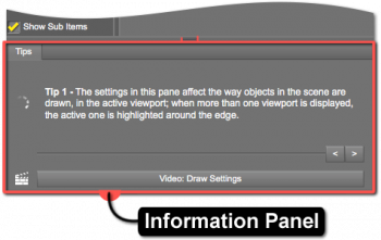
Information Panel
An Information Panel displays tips or hints about using the Pane (Tab) it resides in. Note that each pane that provides an Information Panel includes different information that is in the context of the pane itself and its specific purpose. For example, one pane may include only a Tips page, while another pane may include Tips, Info, Tags, and Store pages.
Adjustment
The height of the panel can be manually adjusted, minimized to just the page labels, or collapsed completely.
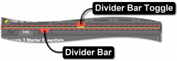
Adjusting the height of the panel is accomplished by clicking and dragging the Divider Bar that is positioned between the labels for the pages and the rest of the pane. Minimizing the panel, such that the page labels are still visible while the panel is closed, is accomplished by clicking the label of the forward-most page in the stack when the panel is expanded. Clicking the label of any page in the panel while it is in a minimized state will expand the panel and display the page clicked.
To collapse the Information Panel completely, hover the cursor near the center of the divider bar until it becomes highlighted, and then click the Divider Bar Toggle once. Expand a panel that has been completely collapsed by clicking the toggle on the divider bar.
When the cursor is hovered over the toggle, the highlight displayed provides indication of the direction the bar will move. This is represented by shifting the side the highlight is displayed onto the side corresponding with the direction the bar will move.
Pages
Tips Page
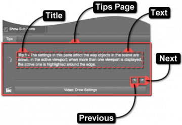
The Tips Page displays information describing how to better use the pane and/or current page. Its focus is generally the pane as a whole rather than specific properties.
Tip Title
The Tip Title typically consists of the tip number but can be anything the author of the tip chooses. The purpose of the title is to provide a unique name that can be used to quickly distinguish one tip from another.
Tip Text
The purpose of the Tip Text is to provide useful and perhaps less commonly known information about the pane and/or active page.
Next Tip
When clicked, the Next Tip button (“>”) causes the tip sequence to advance and the next tip to be displayed. The tip sequence automatically loops to the first tip when the button is clicked while the last tip is being displayed.
Previous Tip
When clicked, the Previous Tip button (“<”) causes the tip sequence to reverse and the previous tip to be displayed. The tip sequence automatically loops to the last tip when the button is clicked while the first tip is being displayed.
Video(s)
When clicked, video buttons cause online video explanations of the pane and/or pages within the pane to be opened.
Customizing Tips
To Do: Provide a description of where tips are stored on disk and how to manage them.


